>Not simplistic enough to be over marketed like the minions, not over designed like the "harmony power" ponies from the season 4 final As for the overdesigned aspect, the design department was planning about making Queen Novo blue and the hippogriffs were much more alien to the spirit of this show. Sure, they would have been more outstanding....but more outlandish and too complicated for the world established (like the previous pic)
I was going to bring up the Minions at some point but this serves more for ponies in general.
For starters, the seapony design has the same body structure to draw for eveyone who transforms so that makes them as simple as drawing a pony. It replaces the hooves from the back with a pretty big tail and one unique aspect that comes from the design is by creating another fin for the Cutie Mark with personal forms for each pony. Pretty genuine. Also those who have wings amplify their bodies more than the pony design to make them more flowing (which makes sense considering the fluid medium).
So, about the Minions. They have been exploited to death, they have had astronomical waves of marketing to the point in which it gets obnoxious for those who are not looking out for them (FiM seems like an educated angel when it comes to commercial strategies) and its movie is the 2nd highest grossing animated film of all time (I think?). So they are popular and universal but here it´s the catch: can you tell me about a single aspect unique of each one? Or hell the main three ones? Any character trait? Anything that stands out above the other one?
So when it comes to design, FiM has always stayed simple and it shows.
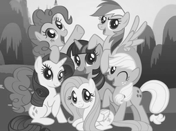
An exercise of that is showing pictures of them in black and white. The colors are what have saved them to stand out and you can notice in the most iconic picture of the mane 6 that all of them share those anime eyes that definitely look for the easy route for sales ("buy them buy them!look at their shiny colors!" mindset). No wonder Rainbow Dash became really popular among them because she stands out with a more defiant look and easily, turning out as the tomboyish figure of the six that appeals to males as well (she is competitive and that look helped a lot).
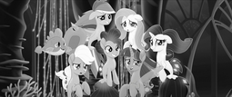
You know, colors look nice and they appeal a lot but they say that a black and white picture shows the essence and emotions of those who appear in it. Now, see the other one, can you mistake them?
Same protagonists and cutesy designs (seaponified) with no color at all to make them different other than basic tones of BW. Maybe for Roseluck, Amethyst Star, Lyra and Minuette altogether would have proved that Hasbro is horrendously cheap when it comes to designing characters but the question is: