>>5286 >It feels purposful and it looks like it could work well into a cut out animation or children's storybook style. the fact that it´s earned some sort of value makes me smile a little bit. I certainly didn´t want to visit and see my old drawings again so this twist has made me put some faith on one of those pictures I made in the past.
And probably you are right about your statement.
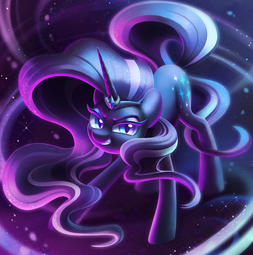
>I actually consider the first one better with the second one having higher potential with a smoother cut. probably. The biggest con that I would say towards the first version is that the contours of her body don´t look all that well defined when someone checks the entire image. It´s hard to tell her form with that those thin subtle lines.
>It probably looks the smoothest. and the most balanced I think.
>I like the yellow but I think I have to agree. when it comes to that edit, I see the contours way too saturated of yellow. While it presents itself nicely at first sight before clicking on it, the problem arises when the yellow contours have too much colour intensity. I don´t know how to explain this without experiencing it by yourself but basically, I will say this: watch the full image and try to stare at it for a few seconds. The sense that I get is that my eyes get somewhat tired of seeing it or receiving like a visual impact that overwhelms me. The thumbnail is great but I swear that I get a slight fatigue by seeing it after a while. I don´t perceive that with the rest.
>It i could color it good than yes, it could be an interesting look. you can see it with the comic cover that I have posted for having a reference that the idea could actually work, not to mention that it offers the biggest variety of colours in comparison.